
Creating a Landing Page
Landing Page setup
- Naming landing page - The page name, display name, title, and description of a landing page follows the same rules explained in the 'naming' page.
- Landing page type - The custom landing page is the only landing page option that is available at the moment and will be comprised of custom blocks to add to the page.
- Landing Banner - Landing page banners are pictures that appear above the rest of the page, they can be 'Static' (singular) or 'Carousel' (multiple and alternating).
- Banner Class - For the time being will be exclusively 'staticBanner'.
- Add custom blocks - This will be the majority of the landing page, using custom information blocks to add to your landing page in a custom order.
Found below are guides to creating and editing custom blocks.
How to locate a block to edit
To edit a block on a landing page, navigate to the landing page that the block is located on and click 'Edit'. Next, scroll down to the section that says 'Custom Page Options', the block will be located under the 'Add Custom Blocks' area.

Finally, right-click on the block that you want to edit, select 'Edit' on the pop-up menu, you'll be taken to the menu where you can edit the block's information.

Note: To edit a block that is not yet on a landing page, navigate directly to the parent folder's _assets_ folder.
Welcome Message
- Color Scheme (required) - Will determine the background color scheme in block
- Media Type (required) - Optional video, Youtube link, or image to be added on right side of block
- MP4 Video - Upload the file of the video, contact marcomm for assistance
- Image - Upload the image and add alt text
- Youtube - Give the video a 'title' or label (for accessibility), and enter the Youtube share link
- Header - Header of welcome message
- Message (required) - Body of text in the block
- More Info Link - Link that will appear as 'More Info' under welcome message
An example is provided below:
Welcome Message Block Example
This is a welcome message block with image as its media selection. Here is an example of how an additional info link will appear at the end of your paragraph.
Featured Links
- Header - The header for the block
- Color Scheme (required) - Background color of the featured links group
- Button Color Scheme - Changes the color of the buttons
- Featured Links Group - You can have a maximum of 8 Featured links
- Button Animation - Hover animation for button
- To add a Featured Link press the Green (+) button
- To take off a Featured Link press the Red (x) button
- You can move your Featured Links using the arrows indicated
- Featured Link
- Title (required) - The text for the button
- Link (required) - Default internal link, contact marcomm to add an external link
An example is provided below:
Info Blocks
- Color Scheme - The background color for the block
- Image Position - Determines if the image is on the left or right
- Image (required) - Choose the image to be added (for best results use a 500 x 500 image)
- Image Caption - Decorative images may not need an explanation, but this can be used as alt-text to improve accessibility
- Shadow - Shadow effect to appear around block
- Header - The header of the block
- Simple Text - If your information is only text, put it all under this field
- Editor - The editor is available if you need additional formatting options. Please use Simple Text in all other cases
- Button Link - Button link below the text of the block
- Title (required) - Title of the button
- Link (required) - Default internal link, contact marcomm to add an external link
Examples are provided below:
Info Block Example
Simple Text
This is the Editor text. This info block has an image on the right, with an optional image caption, and an optional button link below.
Info Block Example 2
Simple Text 2
This is the editor text. This info block has an image with its position set to 'left' without an image caption. It also has block shadow set to 'yes' with button link set to 'no'.
Jumbo Buttons
Jumbo Button Group:
- Block Title - Header for the group of jumbo buttons
- Color Scheme - The background color of the button
- Button Animation - Hover effect for button
- Jumbo Button
- Image - Will appear as the top half of the button
- Alt Text for Image - Follows same rules found in the 'Accessibility Check' page
- Link - Default internal link, contact marcomm to add an external link
- Title - Labels the button, appears directly under image
- Text - Appears under title, provides further explanation of where the button links to
An example is provided below:
Jumbo Buttons Block Example
Message From the President, Dean, VP, Etc.
- Title (required) - The position name that will appear after "Message from the ____" in the title of the block
- Profile Picture (required) - Picture of who the message is from
- Message - The main body of text
- More Info link - Can be added under the message, will be displayed as 'More Info'
- Electronic Signature File Type - Optional types for uploading a signature either with none, a typed preformatted font, of file
- File upload - .svg and .png recommended, .jpeg, .jpg, .gif not recommended
- Preformatted font - Signature-like font will be assigned to the typed out name of the person
An example is provided below:
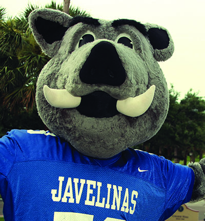
Message from the Mascot
Hello students, this is Porky! Tristique nulla aliquet enim tortor at auctor urna nunc. Velit laoreet id donec ultrices tincidunt arcu non sodales neque. Dignissim cras tincidunt lobortis feugiat. Ipsum faucibus vitae aliquet nec ullamcorper sit. Consectetur adipiscing elit ut aliquam. Tempor orci eu lobortis elementum nibh tellus. Sit amet consectetur adipiscing elit. Et ultrices neque ornare aenean euismod elementum. Volutpat consequat mauris nunc congue nisi vitae suscipit tellus mauris. Nunc faucibus a pellentesque sit amet porttitor. Nibh praesent tristique magna sit amet purus. Aliquet lectus proin nibh nisl condimentum id venenatis a condimentum. Nunc sed augue lacus viverra vitae congue. Faucibus scelerisque eleifend donec pretium vulputate sapien nec. Ornare lectus sit amet est placerat in egestas. Cursus metus aliquam eleifend mi in nulla. Sem fringilla ut morbi tincidunt augue interdum. Tellus orci ac auctor augue mauris augue neque gravida.
Porky
Mini Info Blocks
- Header - The header that will appear above the group of mini info blocks
- Image - Small image that will appear at the top left of the info block
- Block Title - The title of the individual mini info blocks
- Editor - The main body of the block
- Button Link - Button link that appears at the bottom of the block
(Please contact the marcomm web department to change layout from 2 to 3 columns)
An example is provided below:
Mini Info Blocks Example
Title 1
Lorem ipsum dolor sit amet, consectetur adipiscing elit, sed do eiusmod tempor incididunt ut labore et dolore magna aliqua. Ut enim ad minim veniam, quis nostrud exercitation ullamco laboris nisi ut aliquip ex ea commodo consequat. Duis aute irure dolor in reprehenderit in voluptate velit esse cillum dolore eu fugiat nulla pariatur. Excepteur sint occaecat cupidatat non proident, sunt in culpa qui officia deserunt mollit anim id est laborum.
Title 2
- Budgets
- Business Services
- Disbursements, Travel, & Property Management Services
- Financial Accounting & Reporting and Payroll Services
- Human Resources
- Information Technology Services (ITS)
- Logistics
- Payroll Services
- Procurement Services
Title 3
Lorem ipsum dolor sit amet, consectetur adipiscing elit, sed do eiusmod tempor incididunt ut labore et dolore magna aliqua. Ut enim ad minim veniam, quis nostrud exercitation ullamco laboris nisi ut aliquip ex ea commodo consequat. Duis aute irure dolor in reprehenderit in voluptate velit esse cillum dolore eu fugiat nulla pariatur. Excepteur sint occaecat cupidatat non proident, sunt in culpa qui officia deserunt mollit anim id est laborum.
Title 4
Lorem ipsum dolor sit amet, consectetur adipiscing elit, sed do eiusmod tempor incididunt ut labore et dolore magna aliqua. Ut enim ad minim veniam, quis nostrud exercitation ullamco laboris nisi ut aliquip ex ea commodo consequat. Duis aute irure dolor in reprehenderit in voluptate velit esse cillum dolore eu fugiat nulla pariatur. Excepteur sint occaecat cupidatat non proident, sunt in culpa qui officia deserunt mollit anim id est laborum.